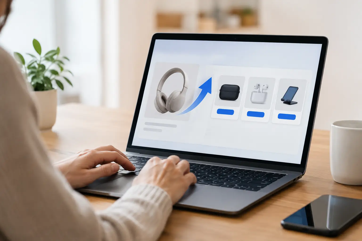
A buyer who has just entered their card details is not asking, “What else can I buy?” They are asking, “Will this help me get the result I came here for faster?” That distinction is what separates the best upsell page elements from the usual pile of vague bonuses, inflated price anchors, and desperate countdown timers.
For digital-product sellers, affiliates, and creators, an upsell is not a second sales page pasted after checkout. It is the next logical step in the buyer’s momentum. Done well, it increases average order value while making the original purchase more useful. Done badly, it creates friction, refunds, and the feeling that the first offer was incomplete.
Start With a Clear Next-Step Promise
The headline has one job: tell the buyer why this upgrade matters now. Do not make them decode the connection between their purchase and the upsell.
If the front-end offer teaches someone how to create lead magnets, the upsell should promise a relevant next outcome, such as launching the funnel faster, getting more templates, or automating delivery. “Add 50 proven lead magnet templates” is stronger than “Get the Pro Bundle” because the buyer can immediately place it in their plan.
A useful formula is: get a more valuable result, in less time, with fewer moving parts. Keep the claim specific enough to feel real. Broad claims such as “Scale Your Business Today” sound ambitious but give buyers no reason to act before they leave the page.
Match the Upsell to the Original Purchase
Relevance beats volume. A $27 add-on that solves the next obstacle often converts better than a $197 package filled with unrelated training.
Ask one question before building the offer: what will this buyer need immediately after using the product they just purchased? The answer might be implementation templates, commercial-use assets, a faster version of the tool, traffic resources, done-for-you setup, or advanced training. The more obvious the next step, the less explanation the page requires.
Make the Value Stack Easy to Scan
Buyers do not carefully study every line on an upsell page. They scan for the practical payoff, the contents, and the reason the price makes sense. Your page needs to make all three visible without forcing a long scroll through hype.
Lead with the primary deliverable. Then explain the supporting assets that make it easier to use. A creator selling a funnel-building course might position the upgrade around a ready-to-deploy funnel pack, then show the included pages, emails, graphics, and setup walkthroughs.
Use a short value stack when there are several distinct components. Each item should answer a buyer question: What do I get? What work does it save? What result does it support? Avoid assigning fictional dollar values to every PDF and checklist. If the value needs a spreadsheet to feel believable, the offer is probably overstuffed.
Show What Changes After They Buy
Features tell the buyer what is included. Outcomes help them picture why it matters.
Instead of saying, “Includes 30 email swipes,” say, “Start your first five follow-up emails with proven angles instead of staring at a blank screen.” Instead of “Includes automation training,” say, “Set up delivery and follow-up without hiring a freelancer for basic funnel tasks.”
This does not mean promising guaranteed revenue. Digital entrepreneurs have seen enough income claims to recognize empty certainty. Frame outcomes around speed, clarity, usable assets, and reduced implementation time. Those are meaningful benefits you can support without overpromising.
The Best Upsell Page Elements Reduce Decision Friction
The upsell decision happens fast. Every unnecessary choice gives a motivated buyer a reason to pause. Your layout, copy, and call to action should make acceptance feel simple and safe.
First, state whether this is a one-time offer. If the same package will be available later at the same price, do not pretend otherwise. Real urgency works when it is tied to a genuine condition: a post-purchase discount, a limited enrollment window, a live support capacity, or a temporary bonus. Manufactured urgency may lift a short-term conversion rate, but it can also weaken trust with buyers who see the same clock on every visit.
Second, make the price unmistakable. Say exactly what buyers pay, whether it is a one-time payment or recurring charge, and what they receive. Surprise billing is not a conversion strategy. It is a refund strategy.
Third, use a direct acceptance button. “Yes, Add the Complete Funnel Pack to My Order” tells the buyer what happens next. A generic “Submit” button leaves too much uncertainty at the most important moment.
The decline path matters too. Use straightforward language such as “No thanks, I’ll continue with my current order.” Do not shame the buyer or hide the option in tiny text. A clean decline link can actually increase confidence because buyers know they still control the transaction.
Add Proof That Supports the Specific Offer
Social proof is useful only when it is relevant. A testimonial praising your front-end product does not automatically validate an advanced upsell.
Use feedback that mentions the exact asset, workflow, or result the buyer is considering. A short quote about saving two days of setup time can be more persuasive than a long testimonial filled with general praise. Screenshots, sample outputs, or a quick preview of the members area can work even better because they show the product exists in a usable form.
For newer offers without customer feedback, replace borrowed proof with demonstration. Show a few templates, a module list, before-and-after examples, or a walkthrough of the deliverables. Proof is not limited to testimonials. It is evidence that the promised value is concrete.
Keep Design Focused on One Decision
An upsell page is not the place for a full navigation menu, multiple competing offers, or a dozen exits. The buyer has already made the primary purchase. Your page should help them make one additional decision: yes or no.
Use a clean visual hierarchy. The headline should establish the opportunity, the first section should clarify the benefit, and the offer details should support the price before the call to action appears. Repeat the button after a meaningful block of copy for longer pages, but do not place it after every paragraph.
Video can help when the product needs explanation or demonstration. For a simple template bundle, a concise page may outperform a ten-minute video. For software access, a complicated automation, or a high-ticket implementation package, a short demo can reduce uncertainty quickly. Test based on the offer, not because video is fashionable.
Use Bonuses Carefully
Bonuses can increase perceived value, but they should reinforce the core purchase rather than distract from it. The strongest bonuses remove a barrier to using the main offer. If you sell a traffic training course, a campaign checklist or ad copy starter pack makes sense. Random PLR products and unrelated software licenses do not.
There is also a point where more bonuses lower clarity. If the buyer cannot explain the main thing they are purchasing after reading the page, simplify the stack. The central offer should always carry the decision.
Test the Offer Logic Before Testing Button Colors
Split testing can improve performance, but start with the decisions that change buyer motivation. Test the upsell’s relevance, price point, format, headline promise, and value stack before obsessing over minor design changes.
Track more than acceptance rate. A cheap upsell may convert at a higher percentage but produce less revenue per visitor than a more valuable alternative. Review average order value, refund rate, chargebacks, support requests, and downstream customer satisfaction. If affiliates promote the front end, give them an offer that improves buyer value rather than one that creates avoidable complaints.
One-click upsells are especially sensitive to trust. The easier it is to accept, the clearer your billing and deliverables need to be. Good conversion is profitable conversion that holds after the refund window closes.
Build your next upsell around the work your buyer wants to avoid and the progress they want to make next. When the offer feels like a practical shortcut instead of an unexpected detour, more buyers will be happy to take it.
Leave a Reply